This guide shows you how to redesign a website using Wireframable without rebuilding from scratch. Crawl your existing site, pull its brand assets, and generate new layout directions in minutes. Get alignment before anyone opens a code editor.
Website Redesign Checklist (Before You Start)
Before generating wireframes, get clear on what you are actually changing:
- What is the goal of the redesign? More conversions? Better mobile experience? Updated brand? Faster load times? This determines what to focus on in your wireframes.
- What pages are changing? Homepage, product pages, pricing, blog? List them out.
- What is staying the same? Brand colors? Logo? Core messaging? Product photography? Knowing what is fixed narrows the design exploration.
- What is the conversion goal? Every page should have one. What do you want visitors to do?
- Who are the stakeholders? List who needs to approve the direction before dev work starts.
- What is the reference? Are there competitor sites or inspiration sites you want to pull from?
With this checklist answered, you know exactly what to feed the AI.
The Website Redesign Process (Step-by-Step)
The beauty of using Wireframable for redesigns is that you start from your actual site. The AI crawls your existing page, pulls your real brand assets, and generates new layouts that feel like a natural evolution rather than a totally different site.
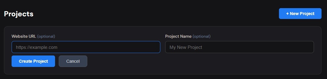
Step 1: Create a Project With Your Current Site URL
Sign in to Wireframable and create a new project. Enter the URL of the page you want to redesign (e.g., your current homepage).
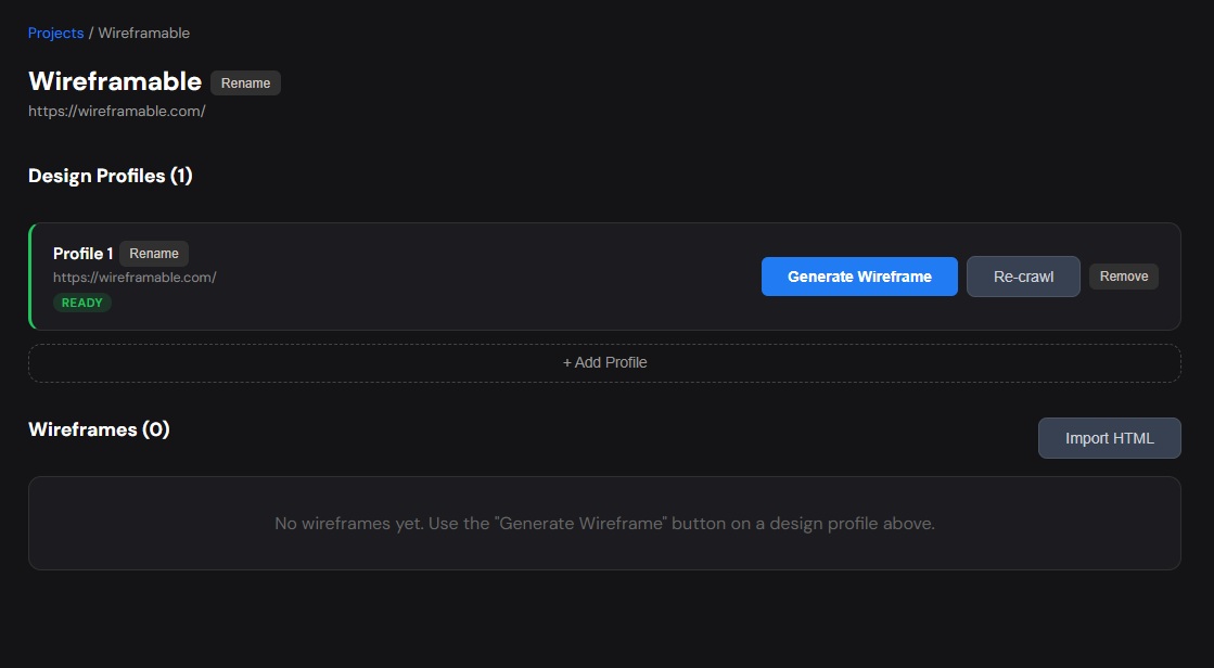
Step 2: Crawl and Generate
Click Crawl on the design profile. Wireframable visits the page and extracts the colors, fonts, images, and page structure in a few seconds. Once the profile shows “Ready,” click Generate Wireframe to open the config modal.
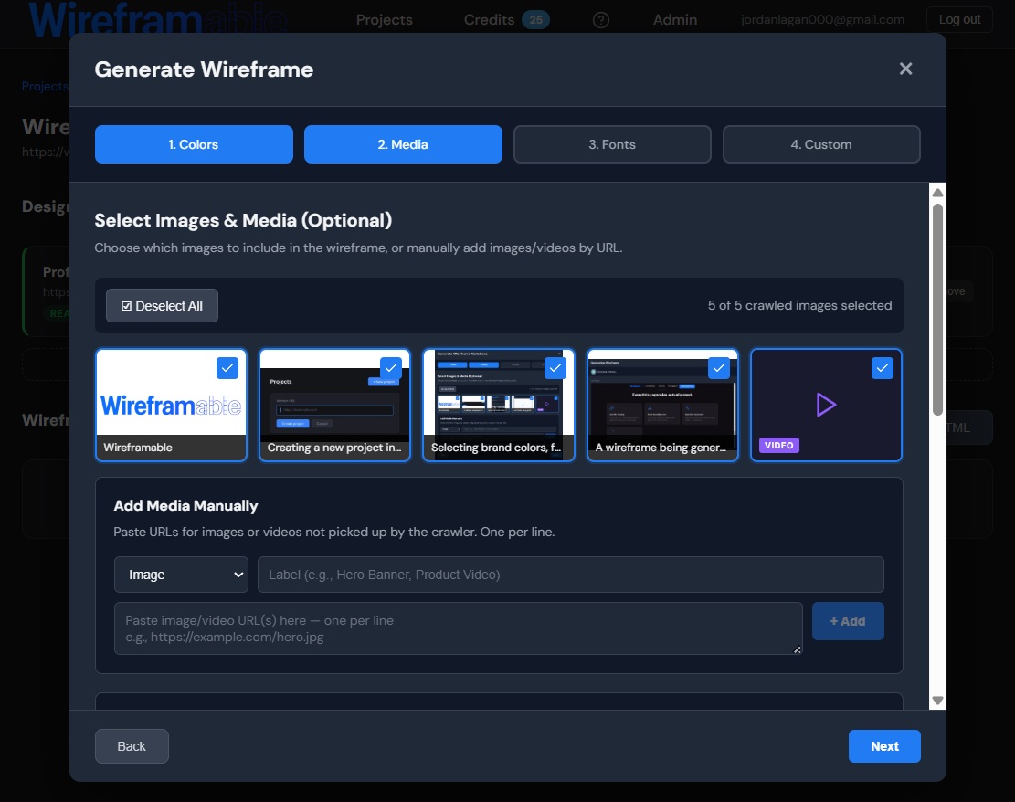
The 4-step flow is pre-filled with your crawled assets:
- Colors – your site’s actual palette is shown. Select the colors you want to keep (you can also add new ones if you are evolving the brand).
- Media – your images are pre-selected. Keep the ones you want in the redesign, remove any you are retiring.
- Fonts – your detected fonts are ready. Keep them, or swap in new fonts if the redesign includes a typography refresh.
- Custom Prompt – this is where you describe the redesign direction.
The prompt is what differentiates a redesign from just regenerating the same page. Examples:
“Redesign this homepage with a more modern layout. Make the hero section full-width with a bolder headline. Simplify the navigation to just 4 links. Replace the feature list with a visual grid of 3 cards. Add a testimonial section before the footer.”
“Take this e-commerce homepage and make it feel more premium. Larger product images, more whitespace between sections, subtle animations feel (overlapping elements, asymmetric layout). Keep the same navigation structure but make it sticky.”
“Redesign with conversion in mind. Move the CTA above the fold. Add social proof (star ratings, customer count) near the hero. Simplify the page to hero, 3 features, testimonials, pricing, CTA. Remove the blog section and team section.”
Click Generate with Live Preview and the AI streams a new layout in 30-60 seconds using your real brand assets.
Step 3: Explore Multiple Directions
This is where AI wireframing changes the redesign process. Instead of committing to one direction, generate 2-3 variations:
- Direction A: Minimalist and clean. Few sections, lots of whitespace, large typography.
- Direction B: Information-dense. More sections, feature comparisons, social proof everywhere.
- Direction C: Conversion-focused. Short page, strong CTA placement, urgency elements.
Each generation takes about a minute. In 5 minutes you have three shareable wireframes that use your real colors, fonts, and images. Send the share links to your stakeholders and get alignment before anyone opens a code editor.
Step 4: Iterate on the Chosen Direction
Once a direction is picked, refine it with targeted regeneration:
- “Move the testimonials above the pricing section”
- “Make the hero image full-bleed and put the headline overlay on top”
- “Add a comparison table between the features section and the CTA”
- “Simplify the footer to just logo, copyright, and 3 links”
Each iteration takes one credit and about a minute. You can go through 5-6 rounds of refinement and still be done in under 15 minutes.
Ecommerce Website Redesign
E-commerce redesigns have specific patterns worth calling out:
Product listing pages: “Redesign the category page with larger product cards, showing product image, name, price, and add-to-cart button visible without hovering. Add filter sidebar on the left with price range, color, size, and brand. Top bar shows active filters as removable pills.”
Product detail pages: “Redesign the product page. Sticky image gallery on the left (main image + thumbnails), product info on the right with name, price, size selector, color selector, add to cart button, shipping info. Below the fold: product description tabs, customer reviews, and a ‘You May Also Like’ carousel.”
Homepage: “Redesign the e-commerce homepage. Full-width hero with seasonal campaign image and shop-now CTA. Below: trending products carousel, category grid (4 categories with images), sale banner, new arrivals grid, trust badges row (free shipping, returns, secure payment), newsletter signup, footer with store links.”
Checkout flow: “Redesign the checkout page. Progress bar at top (Cart > Shipping > Payment > Confirmation). Left side: order summary with item thumbnails, quantities, prices. Right side: shipping form, then payment form. Express checkout buttons (Apple Pay, PayPal) above the regular form. Mobile-friendly, clean, minimal distractions.”
How to Redesign a Website Without Losing What Works
The biggest mistake in redesigns is throwing everything out. A good redesign keeps what is working and fixes what is not.
Keep the brand DNA. Use the same colors (or evolved versions), the same fonts (or a modernized choice), and the same imagery style. The AI does this naturally when you use crawled assets.
Keep the information architecture. If your current nav has 5 items and they cover your product well, keep 5 items. Redesign the visual treatment, not the structure (unless the structure is the problem).
Keep high-performing content. If your current hero headline converts well, keep it. If your testimonials drive signups, keep them. The redesign should improve the container, not replace the content that works.
Change the layout, not the message. Most redesigns are about visual freshness and improved UX, not new messaging. Your prompt should reflect that: “Same sections, modern layout” is often the right starting point.
Tips for a Smooth Redesign Process
Start with the highest-traffic page. Usually the homepage or main product page. Get that right first, and the rest of the site follows the established direction.
Generate before the kickoff meeting. Show up with 2-3 wireframe directions already generated. This turns a vague “we need a redesign” conversation into a concrete “which of these directions do we prefer?” conversation.
Share links, not screenshots. Wireframable’s share feature gives your stakeholders a live preview link. They see the actual layout at full size in their browser, not a compressed image in a slide deck.
Keep the old site crawled. Your crawled profile stays in the project. You can always go back, re-generate, or compare new wireframes against what the current site looks like.
Do not redesign everything at once. Start with one page, get alignment, refine it, then move to the next. Generate each page as a separate wireframe within the same project to keep everything organized.
Frequently Asked Questions
Can I crawl a page that requires login?
Currently, Wireframable crawls publicly accessible pages. If your page is behind auth, you can still manually add your brand assets (colors, fonts, images) and describe the layout you want in the prompt.
How is this different from just hiring a designer?
It is not a replacement for a designer. It is a tool that makes the design exploration phase faster. Generate wireframe directions in minutes, align with stakeholders, then hand the chosen direction to your designer or dev team for the final build.
Can I redesign a site that is on a different platform (Shopify, WordPress, etc.)?
Yes. The crawl works on any publicly accessible URL regardless of the platform. It extracts colors, fonts, and images from the rendered page, not from the CMS.
What if my current site is ugly and I want a fresh start?
Crawl it anyway for the brand assets (logo, colors), but write a prompt that describes a completely new layout: “Ignore the current layout. Redesign as a modern single-page site with these sections: …” You get fresh structure with familiar brand elements.
How many redesign concepts should I generate before deciding?
Three is usually the sweet spot. More than that and stakeholders get paralyzed. Generate three distinct directions, pick one, then iterate on it.
Can I use the wireframe as the actual new site?
The output is clean HTML and CSS, so technically yes. Some teams use it directly for landing pages or microsites. For complex sites, it is better used as a reference for the dev team building the real thing.
Start Your Website Redesign
Crawl your current site, generate new layout directions in minutes, and get alignment before writing a single line of code. The redesign does not have to be a months-long ordeal.
Try it free → 3 free credits/month, no credit card required.