Are you trying to speed up your design workflow, or are you just looking for a shortcut to jump into development faster?
I am going to walk you through how to wireframe a hero section that actually works, follows best practices and can be produced in less than 2 minutes.
Why I Care About This
I build websites for clients. For a while I was losing contracts because the design phase took too long or cost too much for people to say yes to. By the time I had a polished mockup ready, the client had gone with someone faster or just lost momentum entirely.
I needed a faster way to get from “here is the concept” to “here is what it looks like” without spending three days in Figma before anyone had even agreed on the direction. That is what led me to eventually building a tool that does it for me.
What Makes a Good Hero Section
Before we get into the how, it is worth knowing what you are aiming for. A hero section is not just a big image with some text on top of it. The good ones do real work.
Here is what separates a hero section that converts from one that just looks nice:
A clear value proposition. The visitor should understand what this product or service does and why it matters to them within five seconds. If your headline requires context from the rest of the page to make sense, it is not doing its job.
A single, obvious call to action. One button. One thing you want the visitor to do next. Not three buttons, not a button and a text link and a form, just one clear next step. “Start for free,” “Book a demo,” “Get a quote.” If you are giving people choices in the hero, you are giving them reasons to hesitate.
Trust elements and social proof. Logos of companies you work with, a testimonial snippet, a star rating, a user count. Something that tells a new visitor “other people have already bet on this and it worked out.” This does not need to be huge. A small logo bar or a single line of social proof beneath the CTA goes a long way.
Visual hierarchy that guides the eye. The headline should be the biggest thing. The subheadline supports it. The CTA is visually distinct. Everything else is secondary. If someone squints at your hero section and cannot instantly tell what is most important, the hierarchy is broken.
Breathing room. White space is not wasted space. A cramped hero section feels desperate. Give the headline room to land. Give the CTA room to stand out. The best hero sections feel calm and confident, not like they are trying to shout five things at once.
Two Bad Hero Sections and One Good One
Theory is fine but examples are better. Let’s look at what actually goes wrong, and what it looks like when it goes right.
Bad Example 1: The Wall of Text
Two big paragraphs sitting above the fold. Too much to read, so users will skim all of it. No value propositions, no trust signals, no social proof visible without scrolling.
Bad Example 2: The Pretty But Empty One
Professional video, clean design, looks polished. But all the key trust elements and value propositions are missing. A visitor has no idea why they should care or what makes this different from anyone else.
Good Example: Clear, Confident, Converts
Clear headline that tells you what the product does. One CTA. Trust elements and social proof visible without scrolling. The visitor knows what this is, why it matters, and what to do next within five seconds.
How to Wireframe a Hero Section in Wireframable
Here is the step-by-step. The whole process takes under two minutes once you have done it a couple of times.
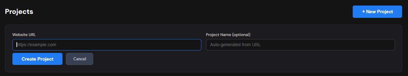
Step 1: Create a Project and Crawl the Website
Start by creating a new project in Wireframable and entering the URL of the site you want to wireframe. This can be the client’s current site, a competitor, or an inspiration page that has the kind of hero section you want to riff on.
Wireframable crawls the page and pulls the structure, content, images, colors, and fonts automatically. You are not starting from a blank canvas. You are starting from a real page.
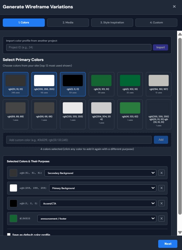
Step 2: Select Brand Colors
Once the crawl finishes, click ‘Generate Wireframe’. Wireframable auto-detects the colors used on the site. Pick the ones that match the client’s brand or select your own. This means the wireframe output will already feel on-brand instead of generic.
(Tip: Label the colors according to how they are used on the base website for better brand alignment.)
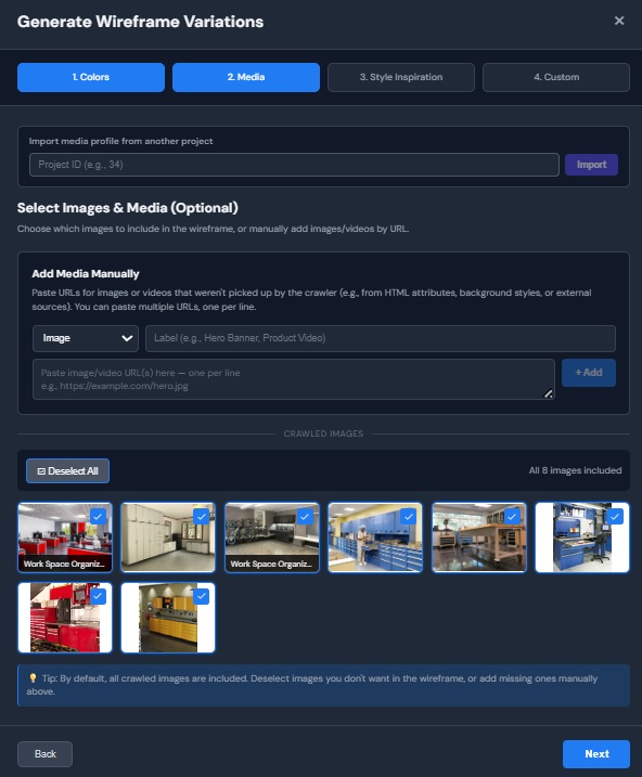
Step 3: Select Brand Assets
Same deal with images, logos, and fonts. Wireframable pulls them from the crawled page. Select the ones you want the wireframe to use. If the client has specific assets they want included, you can manually add the URLs of images or videos you would like included. Labelling your assets will help the generation be more accurate.
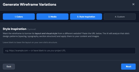
Step 4: Add an Inspiration URL
If there is a site with a hero section you like, paste that URL in and Wireframable will pull design patterns from it. This is useful when the client’s current site is not great but you have seen a competitor or a reference site that nails the layout you are going for.
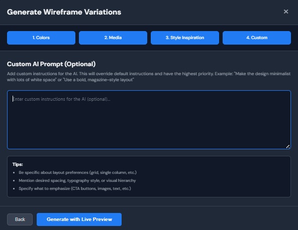
Step 5: Write a Custom Prompt
This is where you steer the output. In the custom instructions field, tell Wireframable what you want the hero section to look like. Be specific. Here are some prompts that work well for hero sections:
- “Design 3 different versions of the hero section. Each should have a clear headline, a single CTA, and some form of social proof.”
- “Redesign the hero section with a split layout. Headline and CTA on the left, product screenshot on the right. Include a trust bar with client logos. Output only the hero section.”
- “Make the hero section more conversion-focused. Add star ratings, a short testimonial, and reduce the number of CTAs to one. Output 3 variations of the hero section only.”
Start broad and let the AI make some decisions. You will get better results giving it room to interpret than micromanaging every element. If the first output is close but not quite right, tighten the prompt on the next generation.
Step 6: Generate and Watch
Hit generate and watch the wireframe build in real time. The AI produces clean HTML and CSS based on the crawled page data, your brand selections, and your prompt. The hero section will be front and center.
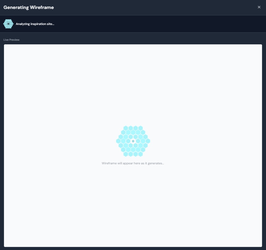
The whole generation takes about 1 to 2 minutes depending on page complexity. You will see everything generating live.
What to Do If Something Is Off
Not every generation is perfect. If the hero section layout is not quite right, or a section did not render the way you expected, you have a couple of options.
Regenerate with a more specific prompt. If the hero section missed the mark, tweak your custom instructions and run it again. Each regeneration costs one credit and your previous versions are saved so you can compare.
Report the issue. If something looks genuinely broken, like a section that did not render at all or assets that got placed incorrectly, use the report button on the wireframe. This helps us improve the generator and we actually read every report.
Where to Go From Here
Once you have a hero section wireframe you are happy with, you have a few options depending on your workflow:
Share it with your client. Click the share button to generate a public link. Anyone with the link can view the wireframe without logging in. This is the fastest way to get feedback. No exports, no attachments, no “can you send me the Figma file” back-and-forth.
Export the code. Every wireframe is clean HTML and CSS. Copy it out and drop it into your project, a CodePen, or wherever you work. It is production-ready enough to start building from.
Import to Figma. If you want to keep refining in a design tool, take the wireframe into Figma and use it as your starting point instead of a blank artboard. You have already skipped the hardest part, which is going from nothing to something.
Generate more variations. Not sure about the direction? Generate two or three versions with different prompts and let the client pick. At $1.50 to $2.00 per wireframe, running a few variations is still cheaper than the first hour of a designer’s time.
Start Wireframing Hero Sections for Free
The hero section is the part of the page where you cannot afford to guess. It is the first impression, the conversion driver, and the thing every stakeholder has an opinion on. The faster you can get from concept to something visual, the faster the whole project moves.
Try it free. Every account gets 3 free credits per month, no credit card required.