This tutorial shows you how to wireframe mobile app screens in minutes using Wireframable. Describe the screen you need, set a mobile viewport, and the AI generates a complete layout you can iterate on and share with your team.
How to Wireframe a Mobile App Screen (Step-by-Step)
Mobile app screens are always built from scratch (there is no live URL to crawl). The flow is to describe the screen and specify a mobile viewport.
Step 1: Create a Project
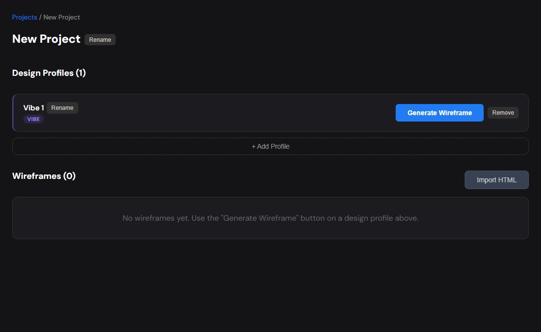
Sign in to Wireframable and create a project without a URL. Name it after your app or feature.
Step 2: Open the Config Modal
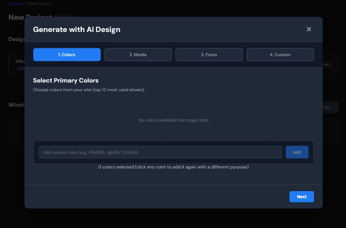
Click Generate Wireframe to open the 4-step configuration modal:
- Colors – add your app’s color palette. Mobile apps typically need: primary brand color, background (often white or near-black for dark mode), text color, accent/CTA color, and maybe a status color (success/error).
- Media – paste URLs to app icons, illustrations, or placeholder images you want included. Optional.
- Fonts – add your app font. For mobile, system fonts (SF Pro, Roboto) are common, or add a custom Google Font.
- Custom Prompt – required (minimum 100 characters). Describe the screen layout, mention it is a mobile app screen, and specify the viewport.
Step 3: Write a Mobile-Specific Prompt
The key to good mobile wireframes is being explicit about the mobile context. Always mention:
- That it is a mobile app screen (not a website)
- The viewport width (375px for iPhone, or just say “mobile viewport”)
- The navigation pattern (bottom tabs, hamburger menu, back arrow, etc.)
- The specific screen you are generating
Here are prompt examples:
Feed/home screen:
“Mobile app home screen for a recipe sharing app, 375px wide viewport. Top navigation bar with app name on the left and search icon + notification bell on the right. Below that, a horizontal scroll row of category pills (Breakfast, Lunch, Dinner, Desserts, Snacks). Main content is a vertical scroll feed of recipe cards, each showing a food photo, recipe title, cook time, and creator avatar with name. Bottom tab navigation with 5 tabs: Home (active), Search, Add Recipe (center button, larger), Saved, Profile. Clean white background, modern rounded corners on cards.”
E-commerce product screen:
“Mobile product detail screen for a sneaker app, 375px viewport. Back arrow and share icon in top nav bar over a full-width product image carousel (dots indicator). Below the image: product name, brand, price (with old price strikethrough for sale), star rating with review count. Color selector with circular swatches. Size selector as a grid of tappable buttons. ‘Add to Cart’ full-width button (sticky at bottom). Below that, expandable sections for Description, Materials, Reviews. Use a minimal, premium aesthetic.”
Dashboard/stats screen:
“Mobile app analytics screen for a fitness tracker, 375px viewport. Top bar with ‘This Week’ title and a calendar icon to change date range. Large circular progress ring at top showing daily step goal (7,432 / 10,000). Below that, a row of 3 stat cards side by side: Calories, Distance, Active Minutes. Then a daily activity bar chart (Mon-Sun). Then a ‘Recent Workouts’ list with 3 items showing workout type icon, name, duration, and calories. Bottom tab navigation: Today, Activity, Explore, Profile.”
Step 4: Generate and Iterate
Click Generate with Live Preview. The AI generates the mobile screen in 30-60 seconds.
Common mobile-specific iterations:
- “Make the bottom nav bar thicker with labels under the icons”
- “Add a floating action button in the bottom right corner”
- “Increase the card spacing and make the images taller”
- “Switch to a dark mode color scheme”
- “Add a pull-to-refresh indicator at the top”
Tips for Mobile App Wireframes
Always specify the viewport width. Without it, the AI might generate a desktop-width layout. Say “375px wide” or “mobile viewport” explicitly.
Describe the nav pattern first. Mobile navigation is structural. Start your prompt with the top bar and bottom tabs (or drawer menu), then describe the content between them.
Think in vertical scroll. Mobile screens scroll vertically. Describe your content from top to bottom: “At the top… below that… then… at the bottom…”
Mention touch targets. If you want large tappable buttons, say so. “Buttons should be full-width and at least 48px tall” helps the AI generate thumb-friendly layouts.
Generate one screen at a time. Unlike web pages, mobile apps are multi-screen. Generate each key screen as a separate wireframe within the same project, then share them together for a complete flow overview.
Name the app type. “Social media app,” “fitness tracker,” “e-commerce app,” or “banking app” gives the AI immediate context about what patterns to use.
Frequently Asked Questions
Does the AI generate native iOS/Android components?
It generates HTML/CSS that looks like a mobile app screen. The components are visually accurate (status bars, tab bars, cards, etc.) but they are not native SwiftUI or Jetpack Compose code. Use them as visual references for your dev team.
Can I wireframe a full app flow (multiple screens)?
Yes. Generate each screen as a separate wireframe in the same project. You can share them all via links for stakeholder review.
What about landscape mode?
Specify it in your prompt: “Landscape orientation, full-width video player at top, controls below.” The AI will adjust the layout accordingly.
Can I do dark mode and light mode?
Generate two versions with different prompts. Add “dark mode with charcoal background” to get a dark variant. Both wireframes sit in the same project for easy comparison.
How is this different from mobile wireframe kits in Figma?
Kits give you components you still have to assemble and arrange. Wireframable gives you a complete, assembled screen based on your description. You skip the layout assembly step entirely.
Can I specify exact pixel sizes?
You can mention sizes in your prompt (“48px buttons,” “80px avatar,” “200px tall hero image”) and the AI will respect them. But for wireframing, relative descriptions (“large,” “full-width,” “compact”) usually produce better results.
Start Wireframing Your Mobile App
Describe the screen, set the viewport to mobile, and generate. One screen at a time, one minute at a time. No artboard setup, no component dragging.
Try it free → 3 free credits/month, no credit card required.